“Just like Dorothy walking into Oz”: Designing the ‘Glamorous’ makeup empire
TV series Glamorous follows the story of Marco Mejia (Miss Benny), a young gender non-conforming queer person whose life seems to be stuck until they land a job working for legendary makeup mogul Madolyn Addison (Kim Cattrall). Join us as we delve into the details of the Glamorous film sets with Production Designer Adam Rowe.
Film and Furniture: Why do the decor details of a film and TV matter?
Adam Rowe: I love the curiosity and desire which Film and Furniture has to know such specifics! I can often get absorbed and fall in love with a show, surrendering to enjoyment. I say this because lots of people have asked me if I get obsessed with the set and set dressing and remove myself from the show. My favourite shows provide pleasure and don’t remove me from the story. The better the show, the more I get transfixed by a lamp, sofa, car or some prop that I just want to know everything I can about it. Most recently I watched Rocky and Rocky II and became intrigued by Cuff and Link, Rocky’s turtles in their atrium bowl!
While working on iCarly, I learned the incredible attention one piece of set dressing can receive. The custom gummy bear lamp she kept on her nightstand drew a lot of attention – thousands of people tried to buy that lamp. The art department had made it a custom piece due to restrictions on what can be considered advertising during children’s programming. That was an excellent practical lesson in the careful attention required when selecting things to be on television. You never know what people’s attention will gravitate to.
F&F: Can you share with us your overall approach to the design of Glamorous, and share some details on your choice of furniture, lighting and décor?
AR: I can distill it down, but no matter how hard I condense the process, I have to shine a light on set decorator Rosalie Board and her shoppers Lily Sadri, Kenny Meinzinger, Brenda McClennin, Laura Keightley, and Jess Smith. As much as I design, plan and problem-solve, I am never alone. There are a lot of moving parts and a large team to help make scripts come to life.
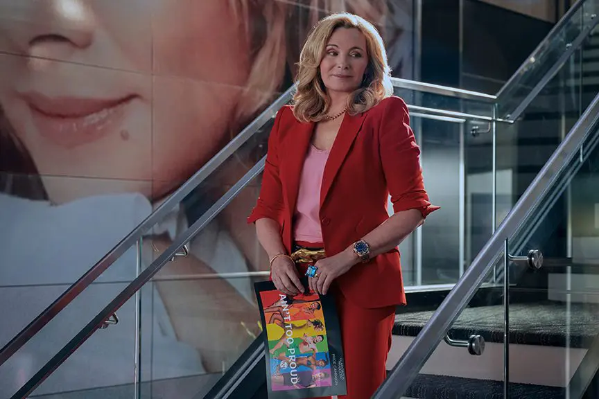
I knew I wanted to give the audience a peek into a world that was sexy, trendy and glossy – something fun to watch. The point of view of the design was Marco’s, and just like Dorothy walking into Oz, I was looking for a wow and wonder effect. There have been so many successful shows set in offices, but none to my knowledge, set in a makeup world. I turned to references from NYX, Sephora, L’Orèal, Chanel and Gotha. I was very inspired by Ingot too.
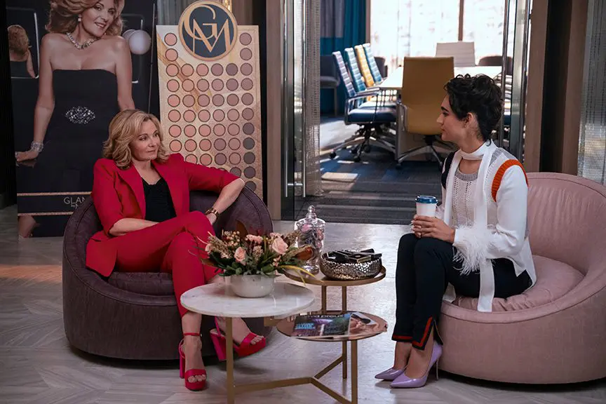
I also turned to successful shows and movies in this arena like Devil Wears Prada, Ugly Betty and The Office, of course. But none as much as Moonlighting and Working Girl. Both came from recommendations from the writer and showrunner Jordon Nardino. The Madolyn shrine in her office is an homage to Moonlighting’s pilot episode when we meet Madolyn. It’s not a coincidence that Glamorous follows someone with the same name as the main character from Moonlighting.
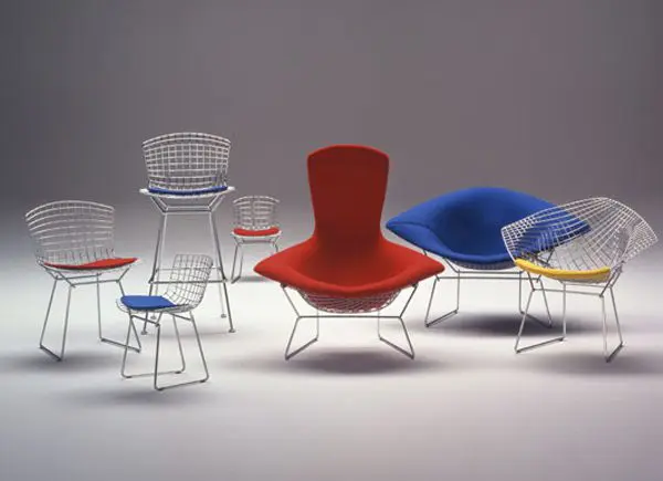
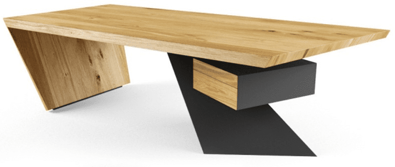
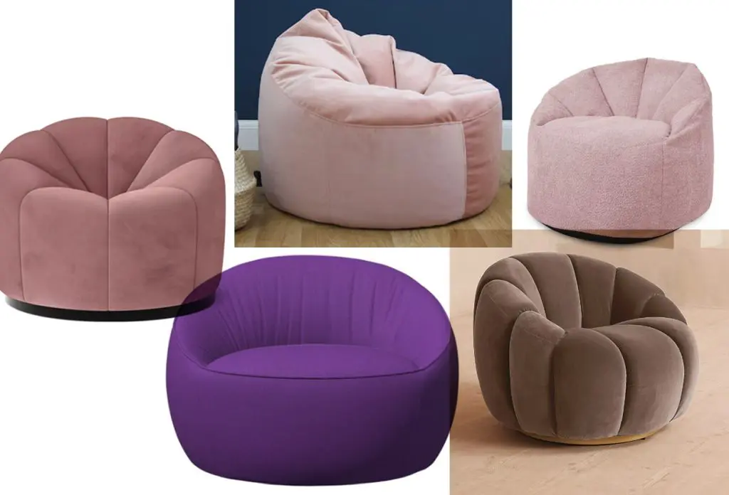
Get the Glamorous look: Pumpkin and round low chairs
Getting real Vogue, Vanity Fair, The Advocate and Marie Claire magazine mastheads was an awesome win from a legal and clearance point of view, in addition to using real Getty images with Kim Cattrall as opposed to photoshopping or inventing a history. These went a long way into the success of the design, I feel.
We were going to be faking luxury, and this part of the design gave me a lot of anxiety. I knew I couldn’t design a world for these characters that was all about luxury makeup and have it look like a knockoff. We had two challenges on this front: time and money. We prepped our sets in 10 weeks, and despite what people may think about shows on Netflix, they do not have a bottomless bank account.
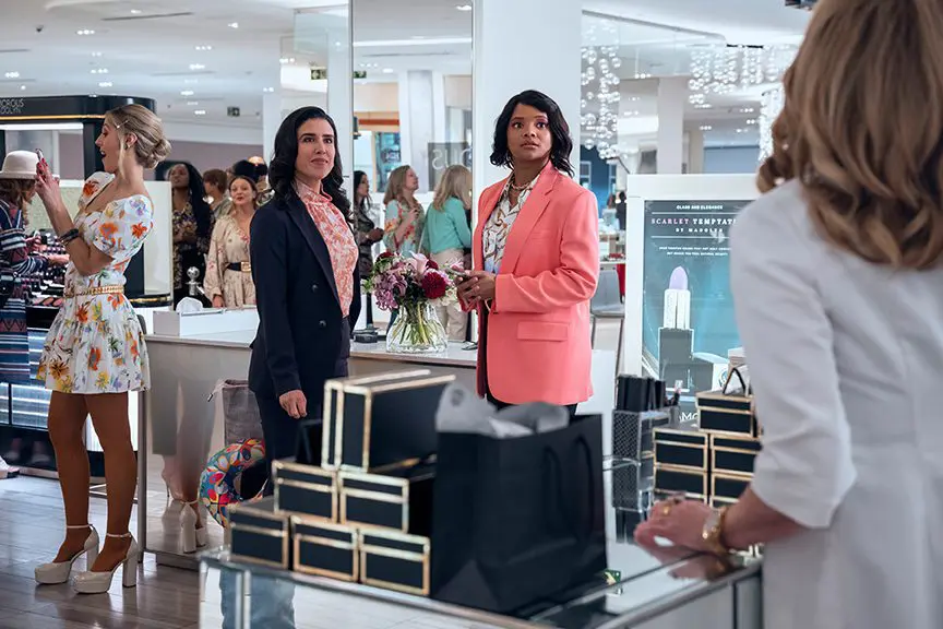
With the help of the set decorator and properties teams, I think we were able to pull that off. Getting custom makeup was out of the question due to our timeline. They sourced a company that brands makeup for artists who do weddings and fashion events, and we couldn’t have pulled it off without them. Pinnacle Cosmetics was able to brand glossy black makeup packaging for us that fit into the luxury lines that already exist. To offset these looks and round out a volume of makeup for Glamorous by Madolyn, Rosalie had sourced makeup racks with makeup from stores that had recently closed.
We did have a few custom objects like the powder and brush moment in the credits right before the title “Glamorous”. Danielle Hebscher, the props master, had the genius idea to turn a to-go container upside down and fill it with power to give the camera an overwhelming scale for a makeup pot, all playing into the sensational and wow factor the design was driving at.
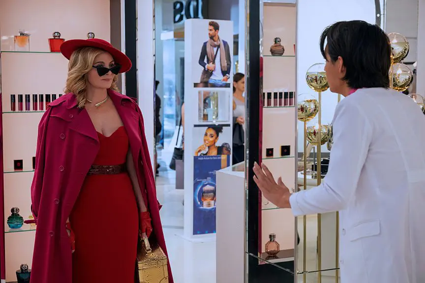
We knew Glamorous by Madolyn was a classic look. She says that when she meets Marco at the mall. I was pulling ideas from L’Orèal, a beautiful and traditional makeup look. Their headquarters are a very beautiful environment.
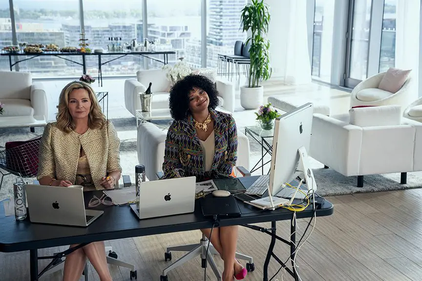
The colour palette of the office started in the black-and-white world of fashion. I knew this would provide a sexy frame for the story and all the furniture in the show. It would also elicit the excitement of a flashy place to work. The colour palette from the furniture came from a series of eyeshadow palettes I loved. I sprinkled in a few colours I pulled from Hollywood glam, particularly a photo of Marilyn Monroe in a teal top. Rosalie went to work with her team in this palette and found amazing fabric and furniture choices. They are not featured a whole lot in the show, “lip stick chairs,” that is what we called them. They looked like lipstick before you twist and extend the makeup from the tube. She upholstered them in pink and purple leather. So sexy!
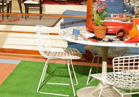
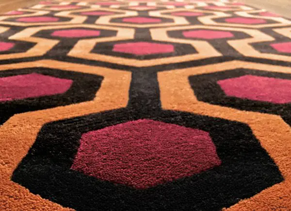
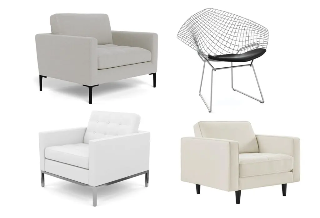
Get the Glamorous look: White armchair and wire chair
When it comes to lamps and lighting, as cameras become more sensitive to light, the lighting during the filming of a project can fall on set dressing. There were so many lamps in the show working hard to light the environments and bounce the light off reflective surfaces, giving depth. I also designed a lot of lighting in the ceiling of the sets, helping to light the characters, giving the directors of photography control in coloration, and bouncing it off the many glass and glossy black surfaces framing the office.
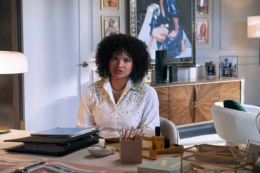
F&F: What inspirations did you draw from when designing Madolyn’s office?
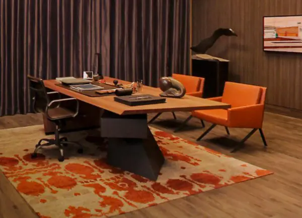
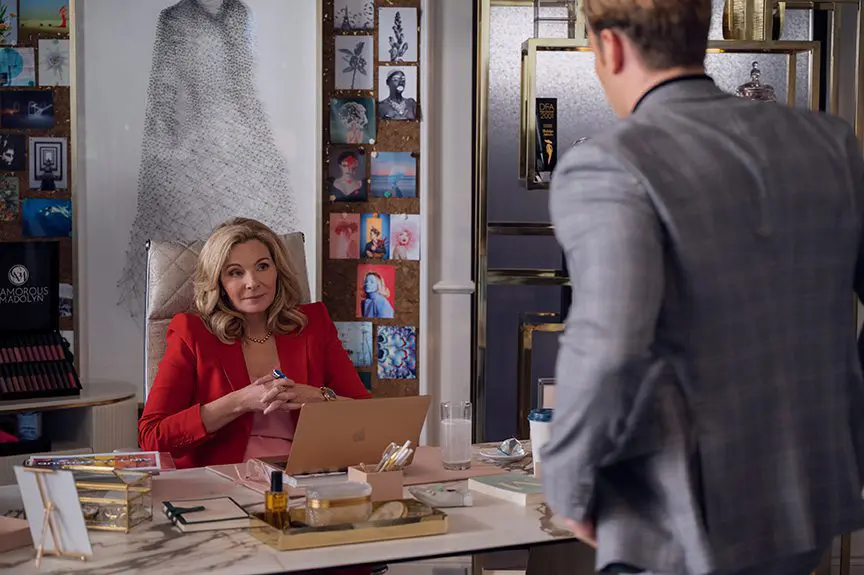
AR: I knew I wanted to set this environment apart from the rest of the Glamorous offices and break away from the black glossy. I hoped that when you came into her office it was comfortable for conversation and demonstrated dignity and power, but still wowed.
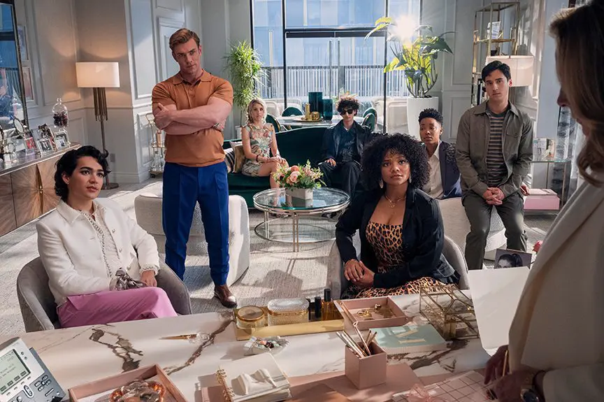
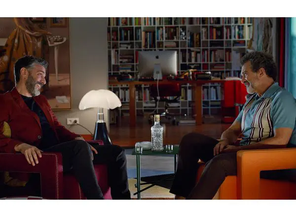
There were many scenes throughout the season here, so we provided a few different seating options, giving the director, characters and director of photography multiple places to set scene like her desk with receiving chairs (in line of sight to Marco), a work table, that fabulous bathtub-inspired green sofa and almost a living room set up around it.
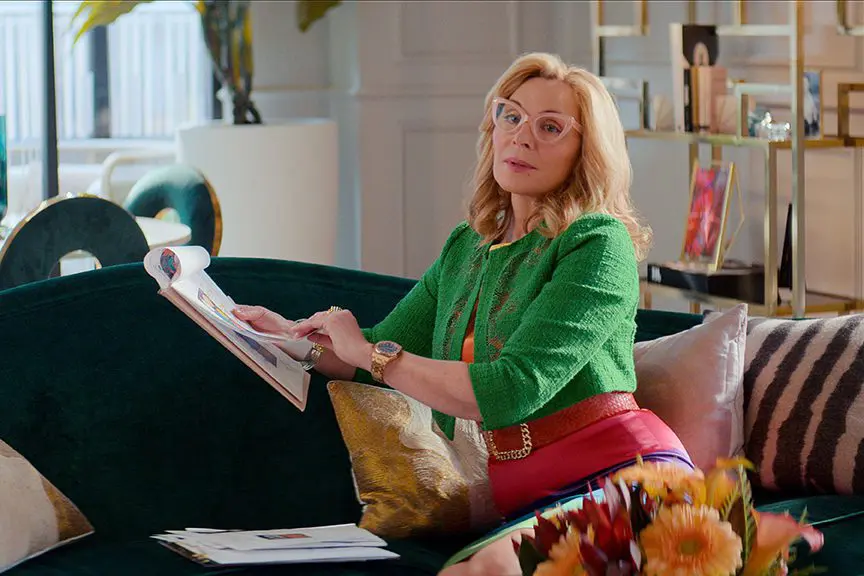
I drew from references of CEO’s offices for the Glamorous film sets and dove hard into Architectural Digest magazines for real working woman’s offices in high rises. I was very focused on trying to get a believable New York look in a new office building.
The light airy colour came from how amazing Kim looks against white backgrounds. I studied her fashion photography from all decades and found she is often photographed against white. So why change what works?
Kim really wanted to be surrounded by makeup, so as the season progressed we added more and more makeup displays, moving out the fashion elements that may have come from her past days as a model. The design evolves through the season and audiences will see the change.
The artwork behind her desk is iconic and I love it. Rosalie found the artist and piece that was all made out of pins.
F&F: How did you elevate the look of the conference room through design?
AR: The curtains in the conference room are referencing a look L’Orèal has in their conference room, two tones with a heavy stripe on the bottom, grounding the look.
The backdrop [of the building beyond] in the conference room is only about 10’ from the windows. This can pose a problem to make the backdrop look unrealistic. I say this because I was always looking for a semi-transparent fabric that would soften the backdrop and give the illusion of distance. I also added the archway detail to force the characters and camera to be further away from the windows.
The sheer fabric Rosalie found. It has a smudge pattern on it and breaks up the backing in a nice way. We liked it so much, we used it in Madolyn’s office as well. You can see the silver tops and blue bottoms on the legs, which helps ground the room and pulls your focus to the seated characters.
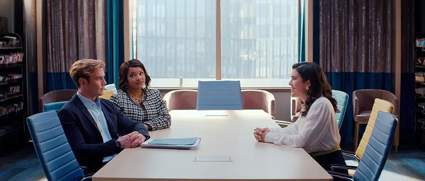
The colour palette of blue with hints of yellow came from research at Sephora’s headquarters, where they have a multi-colour furniture concept in reds for some of their group seating.
F&F: Can you talk about creating and designing for a fake makeup brand?
AR: The most challenging aspect was that we could not call it Glamorous. It always had to be Glamorous by Madolyn, as per the legal department, which is a lot of letters to fit on tiny packaging and a mouthful to say. We did ultimately put that logo onto tiny makeup, but I was inspired by YSL and Chanel to move away from all the letters and associate the brand with what we called the Glam-coin. You see that GM, glam-coin, almost more than you see the Glamorous by Madolyn logo.
After we distilled down from various designs and fonts, we lined up our logos on a sheet with other luxury brands to see if we blended in. I wanted audiences to believe that Glamorous by Madolyn could already be out there, not new to the scene. I also hoped that one day a makeup company would make the brand real so people could wear this makeup at home. As far as I know, that hasn’t happened yet.
We knew the show would feature this product heavily. I am not saying it’s the Ring in Lord of the Rings, but it is a show about makeup, so we gave it the attention it deserved. Hopefully elevated, elegant and a signature for the show.
F&F: How did you choose artwork for the walls of the office?
AR: I was aiming for a level of sophistication, and Glamorous by Madolyn’s fictitious design codes already told us it was a classic look. We stepped away from words on the wall, big lips and other more standard types of artwork seen in the research. Anastasia Beverly Hills and Lancôme played a big role here. They use their products and advertising as the art it already is, displaying it unaltered in simple frames.
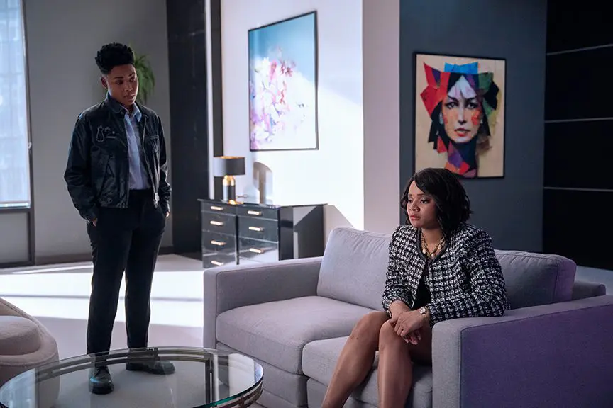
We made a lot of fake advertising for Glamorous by Madolyn and then offset it with Getty stock images of beautiful people. We did learn that Getty still has a long way to go to represent all skin tones. We often struggled to find high-caliber photography that showcased all ages and skin types. We did not have the budget to have custom photography for the artwork for the show. When we came to more private spaces like Chad’s office, we went with local Toronto artists and broke away from the Glamorous by Madolyn statements like in the rest of the office spaces.
F&F: How did the presence of Kim Cattrall influence the design of the Glamorous film sets?
AR: Like a comet that can change the orbit of a planet. I had been designing the sets without the role of Madolyn cast. I don’t believe it was confirmed it would be Kim Cattrall until about four or five weeks out from shooting. At that point, we had already been working on building sets. This world was to be her world, one that Marco was stepping into. So until that role was cast, I was designing what I could knowing soon I would need that role’s personality to layer into the design.
Her incredible career, personality, and history as a performer provided a huge opportunity to establish a history with Madolyn. It gave me the 80s glam nods I think help define the show – soft corners, conservative upright columns and reflective surfaces. Plus I felt the audience was already coming to the show loving Madolyn/Kim, so I had to work with that momentum.
Up until Kim’s casting I had been planning on an ambiguous fashion mural for the centerpiece of the headquarters. A large statement that could act as wallpaper framing the staircase. Once she was cast it was agreed that the ambiguous mural would become a statement to Madolyn’s vanity and we would use her face. It was a great idea and one I didn’t take lightly. I set out to find an image that was appropriate for our story, one that Kim would love to see 25’ tall and an audience wouldn’t tire of seeing. After a lot of studying, revisions, and a wonderful FaceTime meeting with Kim, we landed on the cover photo from the Hamptons. I love it when the directors of photography framed Kim against the mural.
F&F: What about Marco’s bedroom?
AR: Marco’s bedroom was our starting point in the show. Opening the invitation to 10 hours of television. So we dressed it with a lot of care. It was also the set we started filming the show with.
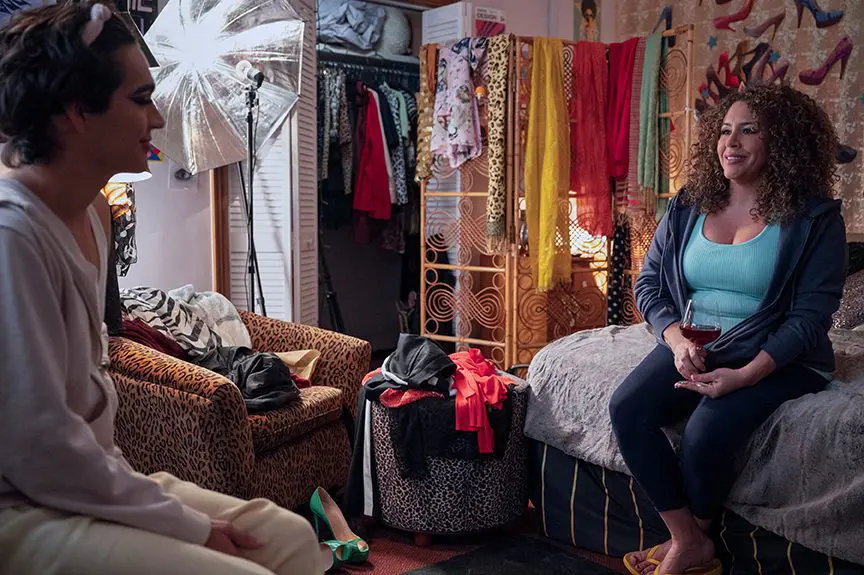
We knew a few things from the script: Marco felt stuck, he wasn’t making much money, he wanted to be an influencer, he loved makeup, he lived with his mom. I wanted his room to feel real and textured. Jordon wanted authenticity all around the show.
So when making choices for dressing we went down the avenues of Marco collecting things for his YouTube channel, spending all of his money on makeup and gear to film. A cheetah chair, a collection of high heel cut outs, a feather M, and lots of clothes. Building layers and layers helps tell a story of use in a room.
F&F: What was the biggest challenge of this project?
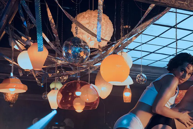
AR: The most challenging to design was the activation event. When Mykynnleigh goes through a quasi-obstacle course to enter The Hinkle Room for the product launch that will save the company! I was developing these moments alongside the Provincetown episode and those two happening at the same time put a lot of pressure on the art dept. We also were trying to be cost-effective while giving Jordon what he was visualizing.
It went through various iterations and scales. The pay off is the performance on the wacky mountain and silly pink car driving through a carwash. The actress Nicole Power is a wonderful performer so I wanted to make sure our design was framing her and giving her some fun things to be hilarious with.
F&F: Can you talk about your collaboration with set decorator Rosalie Board?
AR: The process with Rosalie was a similar collaboration I’ve had with other decorators I’ve worked with: Typically I will do a page of images as references to present. Giving the showrunner, writer, director, director of photography and anyone else who wants to see a concept for the dressing or tone of the room.
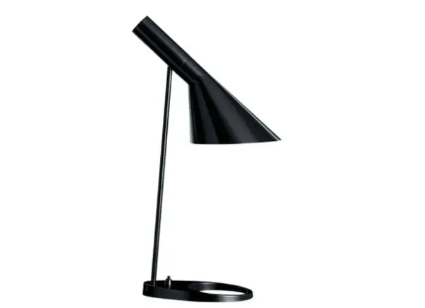
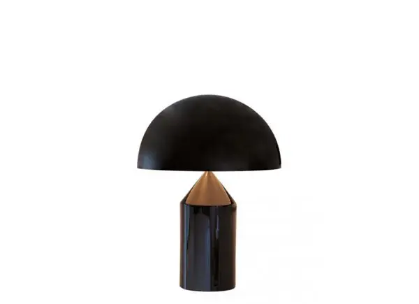
Get the Glamorous look: Pendant lights
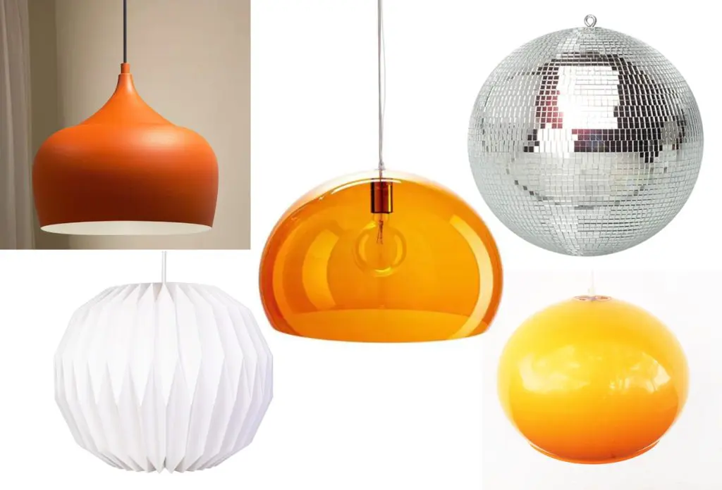
Sometimes there are revisions, but once we have an approved tone I turn that over to the set dec department. From there Rosalie would work with her team to head that direction. Often coming back with amazing pieces or objects or fabric I hadn’t thought of like the fabulous lipstick chairs in the show or the amazing array of lights in The Hinkle Room. It was 100% Rosalie who brought animal print to the show. You can see it pop up in sets along the way. I even think I was reluctant at first to use any kind of animal print and then by the end she had to restrain me.
F&F: Are there any Easter eggs for fans to look for in the show?
AR: Those who knew Miss Benny from YouTube may recognise the clear raincoat hanging in Marco’s bedroom/bathroom door. Marco’s bedroom has quite a few icons on his walls including Doja Cat, Kim Petras, SZA, Dua Lipa, Charli XCX, Ariana Grande, Sophie, and Charlene Incarnate who performs during an episode.
Miss Benny’s childhood photos are on the fridge and on the sofa table in the living room set and Zane’s childhood photo is also on the set in Madolyn’s office along with a whole pile of awesome photos from Kim Cattrall’s past.
There was a small nod to the movie Mannequin that made it to the set – the gold and silver mannequins that glide behind Marco in the mall in episode 1. And there is a mannequin hand on Venetia’s desk.
Ben has a wonderful set of desk decor, but my favourites are a series of dancing cats, a Hippo full of markers between him and Britt and he has a tiny UFO sucking up a cow figurine that always gave me joy when it made it on camera.
The images going up the stairs in Madolyn’s townhouse are all real celebrities applying makeup. Andy Warhol is at the top and was a favourite.
The artwork in Madolyn’s townhouse that is Kim Cattrall’s face is almost a direct copy of the one done of Katherine Parker (Sigourney Weaver) in Working Girl. This is a double nod. One to how inspiring Working Girl was for the show, but also my appreciation for Patrizia von Brandenstein the designer of Working Girl and someone I loved working for on the tv show The Last Tycoon.
Glamorous is streaming on Netflix now.
This feature is FREE to Classic members.
Join our newsletter community to receive Film and Furniture inspiration direct to your inbox and we’ll UPGRADE you to Classic Membership (which includes access to our exciting giveaway draws) for FREE.
To access in-depth features, video interviews, invitations to pre-release film screenings, major exhibitions and more, become a Front Row or Backstage member today!


