The Last Letter From Your Lover: Designing the past and readdressing the present
Production Designer James Merifield takes us behind the scenes on the film adaptation of Jojo Moyes’ best-selling romantic novel, The Last Letter From Your Lover.
The Last Letter From Your Lover is a passionate, dual-narrative love story set in the South of France and London during the 1960s and present day. It tells the tale of elegant Jennifer Stirling (Shailene Woodley) and how her life becomes inextricably interwoven with that of Ellie Haworth (Felicity Jones) in life changing events which connect them across almost half a century.
Jennifer lives a luxurious life with her wealthy and powerful husband Laurence (Joe Alwyn). When an unfortunate event wipes her memory, she struggles to find her identity until she stumbles upon wistful love letters hidden in her home. The passionate notes unravel a star-crossed love affair she had with foreign correspondent Anthony O’Hare (Callum Turner) and ultimately lead her to discover her true self.
Jennifer’s story becomes intertwined with that of Ellie, a whip-smart journalist in contemporary London, who discovers and becomes enthralled by these love letters from a bygone era. As she begins to piece them together with the help of archivist Rory (Nabhaan Rizwan), she sets off on a journey that will entangle the two women’s lives forever.
With authentic period detail and an objective of connecting the two worlds we visit within the film, production designer James Merifield manages to take us on an effortless time travel from the past to present.
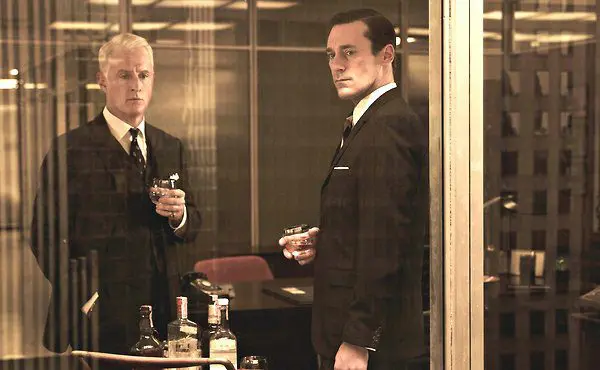
The home of Jennifer Sterling: a high-end library/drawing room
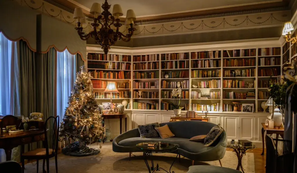
“Here we used a pastel hue to call to mind the period, a gorgeous warmth making this an era of nostalgia and romance. That’s also what the story is evoking between Jennifer and Anthony O’Hare.
We used lots of shapes that were curved and sumptuous, like the window pelmet, the sculptured sofa…a classic look, very feminine. All the book spines were individually covered so that they tonally matched the rest of the set.
This is where Jennifer tends to her orchids. They are a big thing for her. Jennifer is childless and needs something to care for, and the orchids are very much her children at that point in her life. All that she has to nurture…”
1960s London by night
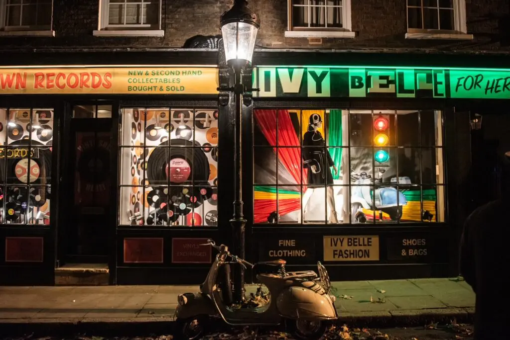
“The colours here are all vivid and retro. Much stronger primaries. It’s very much based on Carnaby Street and Soho of the time. Again, we wanted to do something more gentile, more romantic.
It’s very easy to go over the top and fall into cliché when dressing this decade. We wanted to avoid that trap of loud wallpapers, big patterns etc.. Though these are sets they were all fitted onto real life exteriors. For example, the alleyway above cuts through behind Smithfield’s market. We built all this onto a restaurant in fact that was still operating on the other side! We added a 20 foot long neon logo here above the buildings, with lots of bright light advertisements to really get a really authentic feel.”
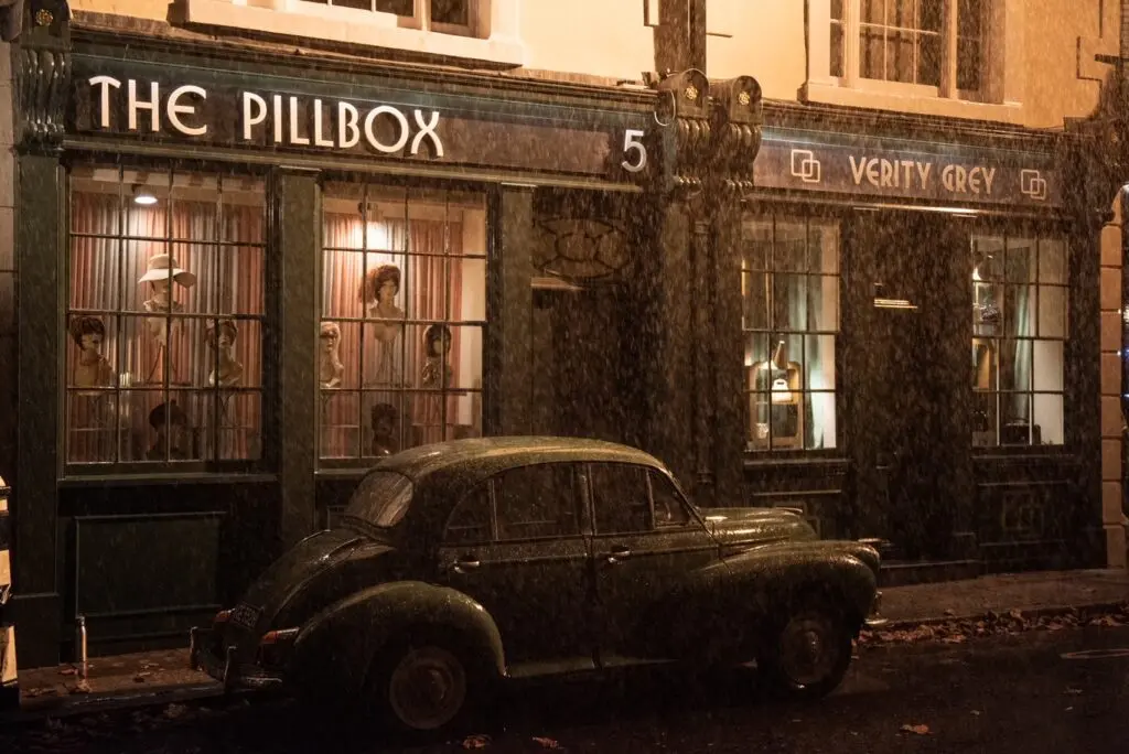
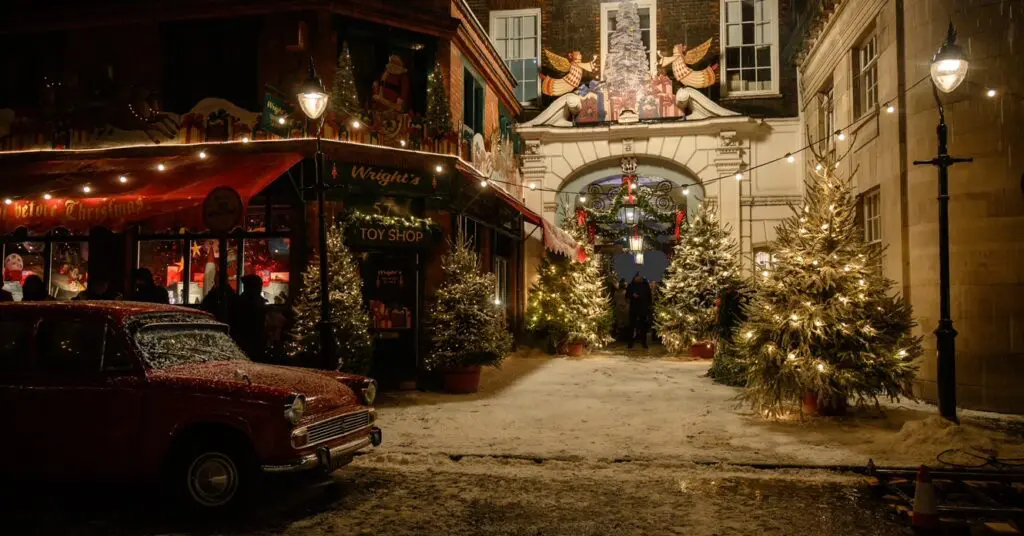
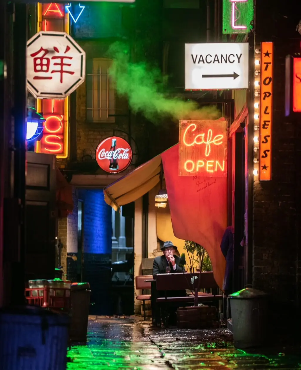
“The Pillbox and Verity Grey shops were again sets builds onto real life exteriors. Lawyer’s offices near Smithfield’s Market to be exact. We built all of the window boxes, dressed them, added graphics and lit them with the same colour palette as before.
Anytime you film in real locations it’s a massive undertaking, especially in London where you are dealing with inner city traffic flow, and businesses that need to keep working. Everything has to be organised well in advance so that the sets are pretty much just flat packs, that can be easily be assembled and dismantled afterward.
For the toyshop setting above I used this stationaries’ print shop in Lincoln’s Inn, which I had previously dressed for a BBC adaptation of Sense and Sensibility.
We were dealing with a seasonal setting, so you have all these Christmas cuts outs with angels, and we layered the area with fake snow. If you look closely into the shop windows you can make out Santa venturing into space on a rocket. This was a nod to the moon landing of 1969, again calling to mind the time period we are in.”
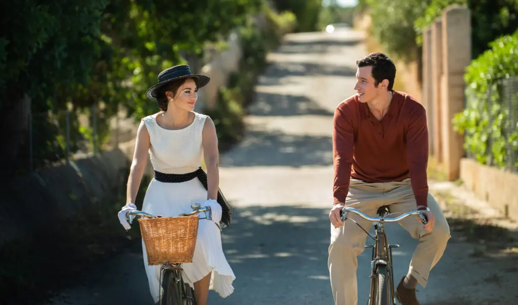
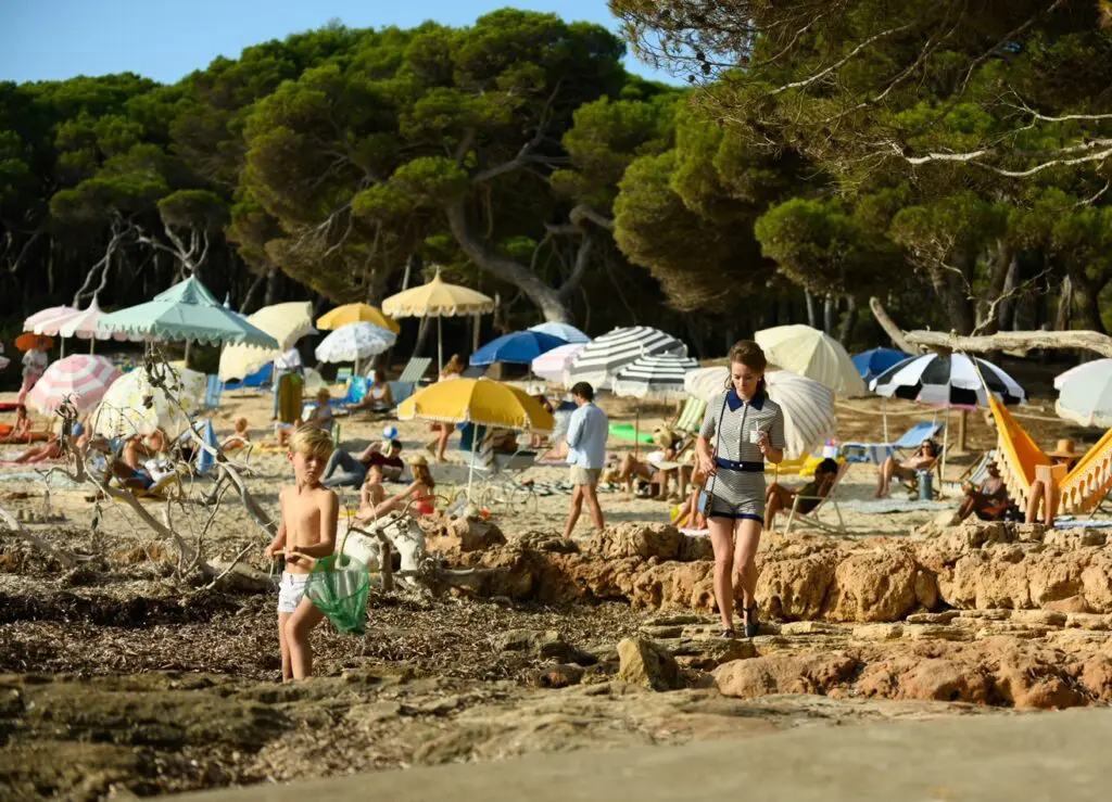
Majorca stands in for the French Riviera
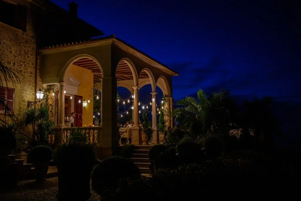
“We dressed the veranda at night where Jennifer and Anthony’s romance takes off. It was a real exterior, a private villa near Deià in Majorca. This was actually quite a big dress. Though the building was lovely it didn’t feel particularly period. All the palm trees, sumptuous greens you see in the shot were bought in to help with that. The fairy lights, tableware and furniture were shipped in from London.
For the beach setting, the striped deckchair fabrics are bold in colour alongside soft, alongside soft pastel shades of primaries in the parasols, picnic hampers and blankets. They mimic the tonal feel of London, but rather than being subdued they are a much brighter and dreamier interpretation.”
Mailing back and forth: the post office sets
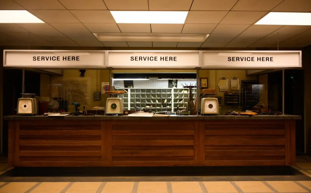

“The post offices were a full-fledged set build at Ealing Studios, where we used the same shell and then just redressed the counter for modern day. We swapped out the counter, added different panels on the front to create that characterless, contemporary location we have all stood in a queue for when mailing something. It was a much larger set than the photo above showcases.”
Crossing time streams: the newspaper offices of past and present
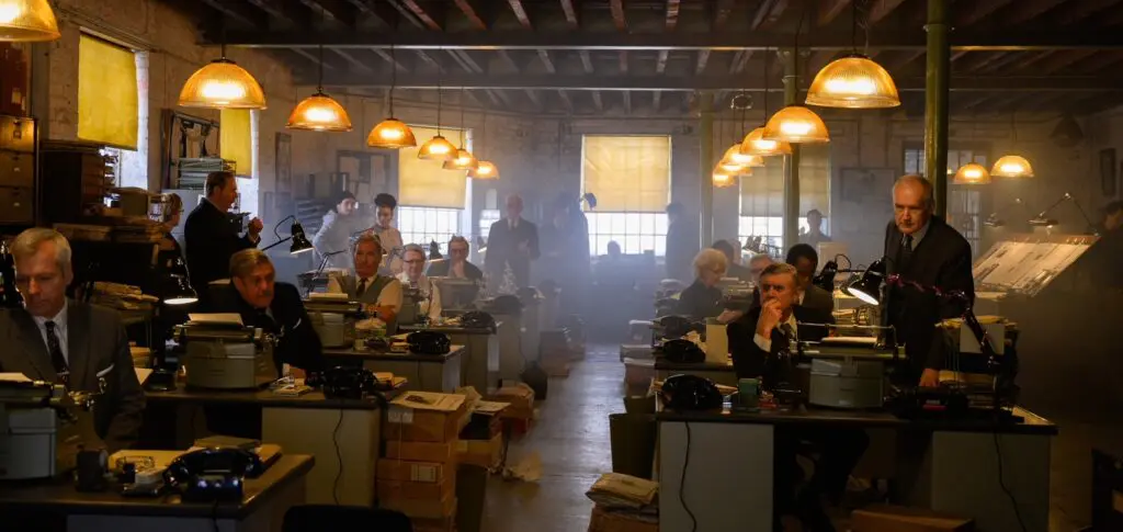
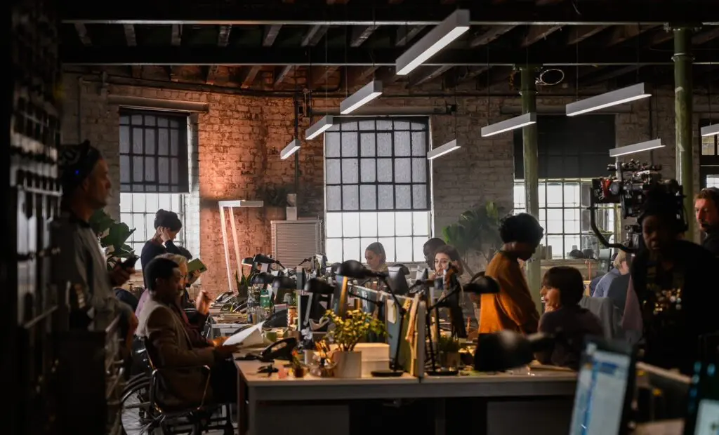
“This was another real life location, but an interior. It was used previously for the BBC’s Dragon’s Den. It’s actually a warehouse in Hackney. For our film we used it as the newspaper offices of our characters, both in the past and in the present.
In the 1960s everyone was smoking, so we have nicotine stained blinds, light fixtures etc… Then we have the period steel desks, telephones, typewriters and angle poisers… As before, the two worlds intercut regularly throughout the film so rather than a tonal jar between that and the modern world, we kept the similar palette and structure in the modern setting. That’s why we have this long linear desk layout, so as you cut between the two time frames with a familiar resonance.”
The Last Letter From Your Lover is in cinemas now.
Read our interview with James Merifield about the design of Mary Queen of Scots: From Court to Castle
James Merifield is represented by Casarotto Ramsay.
This feature is FREE to Classic members.
Join our newsletter community to receive Film and Furniture inspiration direct to your inbox and we’ll UPGRADE you to Classic Membership (which includes access to our exciting giveaway draws) for FREE.
To access in-depth features, video interviews, invitations to pre-release film screenings, major exhibitions and more, become a Front Row or Backstage member today!