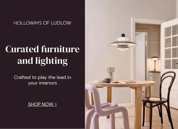
The locations, design and decor of Griselda: An exclusive look behind the scenes with Production Designer Knut Loewe
Set in 1970s and 1980s Miami and Colombia, Griselda captivates with its intriguing locations and striking design. This Netflix series, directed by Andrés Baiz and starring Sofía Vergara, chronicles the rise of Griselda Blanco—a savvy Colombian businesswoman who ascended from obscurity to become “The Godmother” of the underworld. Inspired by Blanco’s life, the series delves into her lethal blend of charm and brutality, which enabled her to navigate both the criminal world and her family life.
Production designer Knut Loewe aimed not just to recreate real-life settings but to envelop actors and audiences in the authentic atmosphere of Griselda’s ascent to power. Join us as we explore the production design, furniture, and decor of Griselda, offering an exclusive behind-the-scenes look at this captivating series.

How did you start the process of creating Miami and Colombia in LA? Was the script very descriptive about the sets – did the show runners have any specific requests or ideas about them?
Knut Loewe: The scripts were not very detailed in terms of what the sets should look like. Very early on the director and the producer Eric Newman signalled trust in my design-skills and world building abilities.
I first started to work on Griselda in the middle of the pandemic. In the beginning, we worked remotely and sent e-mails and mood boards back and forth. Zoomed a lot, as one did at the time in 2021. I started to work directly with the director, Andres Baiz. I only met the writers much later once I had relocated to Los Angeles from Berlin. At this time, we worked with episodes one and two only as the other episodes were still in development.


Since we had decided that we wanted to shoot as much as possible in Los Angeles rather than spending a fortune on travel and accommodation elsewhere, I scouted together with location manager Kris Bunting locations in all of Los Angeles, the Valley, Long Beach, San Pedro, Inglewood, we went even as far as San Bernardino.
On the way, I took many, many photos and grouped them into what I thought would work for either Miami and Florida or Colombia. My designs and mood boards and presentations included scribbles, drawings, photos and reference pictures, and old images from the 1970s and 1980s gathered from period Architectural Digest, ABITARE, and Casa Vogue magazines.
For Florida I went for 1930s and MCM styles and vibrant colours whereas for Colombia I wanted to see more of a Spanish vibe which I achieved by using a lot of dark woods, earthy colours and Spanish influenced textiles.


You are covering two decades in the show, how did you approach creating realistic period interiors? And changing the look of the sets from 1970s to 1980s?
KL: Since I have designed many period and historic films and shows, I have come to the conclusion that it is more important to get the atmosphere right rather than to go 100% period correct. If, for instance, a contemporary wallpaper has interesting patterns and colour schemes, I might as well use it in a 1975 interior.
Another way of working is that I always choose a lot of items, pieces of furniture, architecture and patterns that were produced at least ten years or more years prior to the date in which the scene is set. This way, together with my team together with set-decorator Kim Leonard, we create layers and layers on top of each other, these are ways to make a set, a film location, look “lived in” to make it look genuine.

We play with items such as stereo systems and telephones that, together with costumes and action vehicles, tell the audience exactly what year the story took place. There are no sets that transition from the 70s to the 80s. For the seventies colour palette, I have chosen more orange, gold, and turquoise. For the 80s colour palette, I wanted to be colder together with a more prominent ultramarine blue and silver instead of gold.


One of the big indicators of Griselda’s journey on screen are her houses, which change with each episode. Can you share more how you used her homes as indicators of Griselda’s changing circumstances and your approach to picking locations and designing the final look of each of them? Episode 5 features Griselda’s biggest home yet, Griselda’s wealth is much more on display here. How did you approach the design of the interiors of that house?


KL: In episode one, we see Griselda’s house back in Medellin, and once she and the boys have arrived in Miami she stays with a friend in a rather modest house. For me, as the production designer, to illustrate the progression of Griselda’s financial success by designing bigger and bigger and yet bigger houses, going from a small to a large mansion to an oversized estate, was a joy, I must admit.
At this stage I was working more and more with the writers and shared images of possible locations with them. We thought why don’t we do this or that? The large greenhouse in episode four was originally not scripted, but we all liked it so much that the writers accommodated two important scenes in there.


The estate in Episode five is the backdrop for the party scene. It is also a car show, where all these supercars turn up, and therefore, we needed a large motor court in front of the main entrance. In the show, the house is so big that we decided to work with digital set extensions and even build Griselda’s private apartment on stage, consisting of a master bedroom, dressing room, and study, where she sits between two oversized Fu-Dogs.
The theme for the interior of the house was to be Chinese, to be very expensive, rare artefacts and antiques, expensive rugs, and precious art should be the backdrop for party guests in extravagant 1980s outfits.


Mutiny Club is another iconic location featured in the show. Can you tell us more about it, the details of the ceiling, what references and influences you sought, what your intentions were with the design?
KL: For the design of the iconic Mutiny, I was inspired by legendary New York clubs such as Studio 54 and the MK.
Unfortunately, for quite some time, we couldn’t find a space or a disco that was big enough to accommodate such an idea until Kris Bunting and I scouted the SS Queen Mary in Long Beach. The grand ballroom has so much of what I find important for the design of this particular show: A very high ceiling, large dance floor, beautiful art deco details, and long hallways, it was perfect.

I designed bar counters that were backlit to create extra effects for the people on the dancefloor. We made the space a bit smaller to create a VIP area. This area has extra walls, finished with gold leaf wallpaper and pilasters with indirect light to create a nice silhouette for the cast in front of it.


Unfortunately, as nice as the Queen Mary is, it does not work for any exterior shots. We scouted a more or less untouched 1980s hotel in the City of Industry that would fit the brief. I designed a bright and bold glass ceiling, which I wanted to use in both locations as a connecting element. Otherwise, nobody would believe that the 1930s interior should be in the same building as the 1980s exterior.

Over 200 sets must have required strong teamwork, can you share more about your collaboration with the set decorator and your journey sourcing so many pieces for the interiors? Across the episodes was there any furniture, art, or props that you look back on fondly or are really happy with how they complemented the interiors?
KL: All departments, art, props, set-dec, construction, greenery, and graphics required a certain amount of manpower in order to deliver the number of sets required by the scripts.
The three art directors had split the sets up between them, whereas set-dec Kim Leonard and I were in charge of all the sets, interiors, and exteriors. Previously, we worked on quite a large sci-fi show, Counterpart with ten episodes shot on two continents, on stage, and on location.


On this show, we were real collaborators, working with what we called short-hand, because of the tight schedule, we were rarely in the office at the same time, I often dropped a wallpaper sample together with a colour sample and perhaps a Polaroid on Kim’s desk with a sticky note what it was supposed to be. Kim, on the other hand, left a photo with just one prominent piece of furniture on my desk to let me know what the centerpiece would look like.
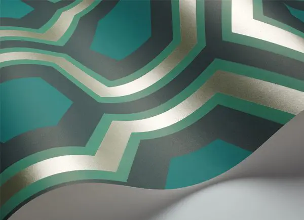
In the case of Amilcar’s Penthouse, that was a Giorgio Armani dining table, for instance, and an art deco cabinet. Those pieces set the tone for the rest of the interior. Very rarely, we went to antique shops together, but more often, we kept sending images to each other’s phones. The physical collaboration took place in the showroom of ASTEK.


If time permitted, we spent hours going through vintage wallpaper books trying to find the exact pattern, repeat, colour palette, and texture. We considered that to be the luxury moments. Once we were there, we often did four or five sets at once since we did not know when we would be able to do it again. Time was precious. As we were doing such sourcing, digging, and researching, we knew that at least a dozen people were waiting for us in at least three or four different locations with many, many questions. But this is what we do and how we do it, and we love it.
Delve into the details of the decor of Griselda on Netflix.
Sponsored post
This feature is FREE to Classic members.
Join our newsletter community to receive Film and Furniture inspiration direct to your inbox and we’ll UPGRADE you to Classic Membership (which includes access to our exciting giveaway draws) for FREE.
To access in-depth features, video interviews, invitations to pre-release film screenings, major exhibitions and more, become a Front Row or Backstage member today!