Ponies: The film sets and interiors of 1977 Cold War espionage (with furniture and décor sources revealed)
In the spy thriller Ponies, set in 1977 Moscow, two American embassy secretaries – Bea (Emilia Clarke) and Twila (Haley Lu Richardson) – become unlikely CIA operatives after their husbands are mysteriously killed. The series may call them “persons of no interest”, but the film sets and interiors tell a very different story.
This is Cold War espionage expressed through wallpaper, marble, mirrored glass and government-issued furniture. Production designer Sara K White reconstructs Moscow largely through Budapest locations, creating a world that challenges decades of Western portrayals of Soviet greyness. Instead, we see bold surface treatments, clashing ornament and distinct visual languages separating American and Soviet spaces.
For design lovers, the detail is the real intrigue. From custom-built embassy desks to hunted-down vintage wallpaper, from flea-market finds to painstakingly recreated period tiles, the sourcing behind Ponies is as layered as its espionage narrative. We spoke with White about rethinking Cold War interiors, and the real-world suppliers that shaped the series’ most memorable spaces.

Film and Furniture: Your approach to Ponies feels very different from how Moscow and the USSR have traditionally been portrayed on screen. How did you approach colour and surface, particularly within Soviet spaces?
Sara K White: When I was brought onto Ponies by Susanna Fogel & David Iserson, we knew colour would be essential in setting the tone. It was immediately clear in the research that I didn’t need to amp up the real Soviet world. What we’d seen in cinema for decades had been a diluted, washed-out version, a fiction created by the West to aggrandise ourselves by comparison. There was actually so much colour and pattern, brightly clashing all over itself, we had more than enough to choose from!

We decided to lean into wallpaper that spoke to each character’s history. We chose styles evocative of Russian history for Sasha’s apartment, mostly in oranges and greens, a tone that tipped into the American Embassy Office. For Andrei, we got a bit more modern in the patterns. I referenced a pattern in a 70s Soviet film, Autumn Marathon – about a two-timing husband, for his home office, which was a special joy for me. That wallpaper was also the only blue tone used in a Soviet space, which gave a subtle nod to the palette of Bea’s Apartment & US spaces in general.
In the American apartments, we brought in patterns in a few key places, but did have to keep it more minimal, as the Embassy apartments wouldn’t usually be too personalised. Dane’s apartment was bare of pattern as a counterpoint to Ray & Cheryl’s, which was bursting with glamorous pinks and oranges – and a very American detail – the gold-veined mirror wall. It was impossible to get something so period and geographically specific over to Budapest in time, so we made our own, layering a graphic element on the mirror, with hand-drawn veining by our Set Dec scenics, giving us the special glitter I remember so well.

F&F: You recreated 1977 Moscow largely through Budapest. What were the challenges in sourcing period-appropriate furniture, decor, tiles, appliances and decorative details? Was there anything you were particularly happy to be able to source and include in the film sets?
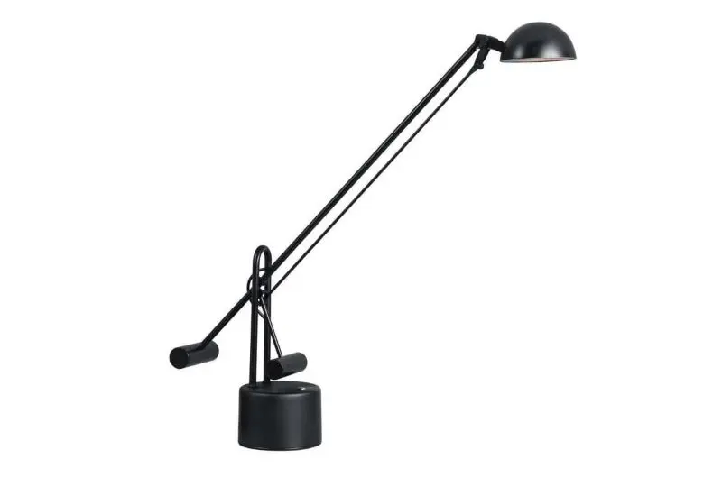
SKW: It was tremendously difficult to find American goods locally. Some smaller props like phones and lamps on desks were brought in from UK prop houses, but we needed items in quantity. All of the desks in the Embassy office & the CIA office were made by our talented set decoration construction team.

The embassy ran on US power, so American appliances had to be procured. We could only find one grouping, but they didn’t match, so we custom-painted them & reused the same set, shuttling it between apartments. We also 3D printed smaller detail elements. The plugs on all of the lamps were European, so we faked it. We created a sham plug that we slid over the cord and stuck it to the outlets – a fun little secret that even most of the crew didn’t know until they tried to unplug one.

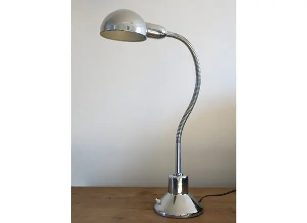
Sourcing all of the Soviet goods was a walk in the park – and that was so fun. Snagging great details like Sasha’s green-stringed lamp that’s later bugged, was only hard because we had so many options. I was particularly happy about all of the wall carpets we were able to find. Many of the crocheted versions were real period wall hangings that gave so much authenticity to each space.
In all cases, tiles were tricky. Getting period-appropriate colours & patterns at quantity in the proper sizes (4” x 4” for American vs. 10cm x 10cm for Soviet) was near impossible, so most of the patterns were custom-printed, and colours were custom-painted onto the tiles. One of the most fun spaces was Sasha’s bathroom, which used a few different tiles. Contrasting it with the brilliant orange vintage floral linoleum that “hid a broken floor” was another incredible detail that came from our references, and we were able to source a period-created product. I was particularly keen to represent the resourcefulness of the human spirit stuck in a broken system – so showing skewed or replaced tiles in the tub’s surround was a detail that gave me great joy.

F&F: The US Embassy interiors are striking – classic wooden desks and angular layouts, to paintings that get stolen and replaced. How did those spaces come together?
SKW: Designing the overall shape of the space was inspired by a late-in-prep exterior location change. We moved from a library to the Hungarian Ministry of Finance – a hulking building with a lot of eclectic details and a trapezoidal footprint. I used that to create the hinged floor plan and justify an angular double-wide Soviet-designed column that confronted everyone who entered the office.

Pulling from the materials in the actual building, I knew I wanted to play with the red, pink, brown & beige marbles that came to define many of our Soviet buildings. I played against that to develop the overall palette of the space, which leaned into 70s avocado & teal with gold-toned accents. The contrast of the bright orange desks was too much fun to deny and I liked nodding toward the warmer tones when there’s a mole sitting in one of the office desks.

Finding all those period Steelcase desks, for the main office & the CIA’s Yellow Submarine office, proved impossible. So our set dec construction team built them all, no easy feat. We leaned into the idea that each of the closed-door offices would reflect the personality of the occupant in part because we couldn’t find enough office chairs that matched! It let us use some tremendous vintage finds from the flea markets, like Shep’s mustard arm & desk chairs. I wish we could credit the makers, but many of these were from smaller design houses that have since disappeared, along with the identifying tags.
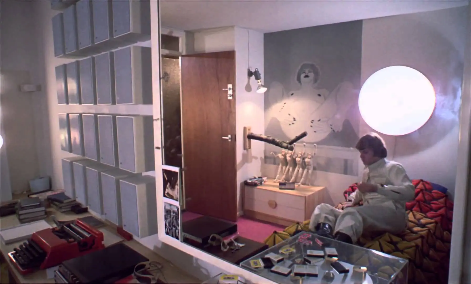
F&F: The apartments feel lived in and reflect the characters. How did lamps, textiles, patterns, and other decorative elements shape them?

SKW: I really love telling the story of characters through their domestic spaces; it was something my set decorator and I were in sync on. We paid special attention to small details like a glass of water on the nightstand, makeup on the vanity, or a pair of glasses on the side table. We wanted to always hint toward life happening outside the scripted scenes.
To that end, I explored Twila’s rootless nature by keeping the space more spare, with either the government-issued furniture or by using knock-offs of Percival Lafer’s sofa set, for example. We were able to find much of the Queen Anne style bedroom furniture issued by Embassies Housing, from America’s own Drexel Heritage. There wasn’t a lot of history in her decor, unlike Bea’s apartment.

Bea’s has finer midcentury Scandinavian pieces mixed with furnishings & decor from the American 50s. I wanted to keep it a bit conservative and more feminine to relate to her upbringing and expectations for how life would roll out in front of her. In her dining room, I used a blue floral stripe from Rosie’s Vintage Wallpaper, an outlet in Illinois that has a great website & (thankfully!) international shipping. I loved florals for her, so we used a delicate faux-bois with yellow magnolias in her present-day bedroom. In flashback, we see her in her childhood bedroom – I used a delicate pink floral paper, again from Rosie’s, which we also printed on curtains and bedding, to surround her innocence in that moment.
F&F: The hotel is another striking space. From the circular floor plate to the tiles in the bathroom, it’s evocative of that time period. Tell us more about finding and dressing that location.
SKW: Our location manager took me to Hotel Budapest the first week I was in town. He knew it was iconic, and at the time, neither of us knew it was not long for this world. We didn’t need it until months later when we started scouting for Hotel Intourist – by which time it had been slated for demolition and the process of stripping the mechanical systems had already begun.
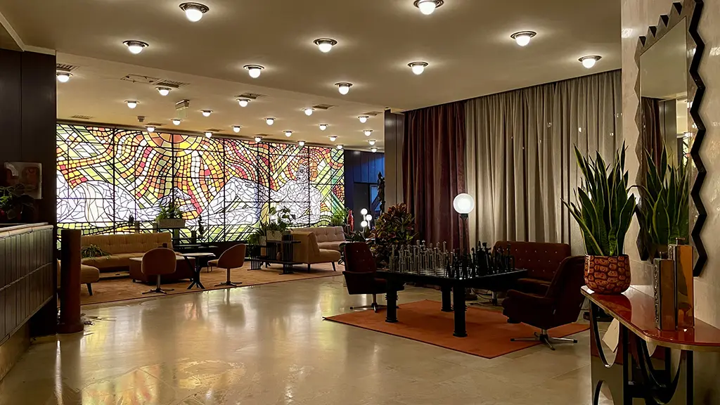
After a long negotiation, we had to quickly repair the damage from the intervening months, replacing water-soaked walls and ceilings. We restored the original finishes of the lobby space, tracking down original light fixtures so the real sense of glam came through. We fit it out with a custom-designed glass mosaic with two lounging nudes gazing at each other, which was inspired by the original Hotel Intourist and hinted at the scenes to come. The overwhelming orange hue also came from the original – a striking photo from an Intourist Ad glowed tangerine, I couldn’t resist.

We had to build our main hotel room on site, to give us enough space for our scenes. The bathroom where Twila & Ivanna explore their attraction drew from period 70s hotel bathrooms, but I wanted it to add a bit more spice. I got the idea for the deep, sexy burgundy from the bombastic design of the era’s love hotels. It was too much to go with a heart-shaped tub, but the gloss and the mirrors were a cheeky nod.
F&F: The restaurant setting feels rooted in an earlier architectural grandeur, yet layered with distinctly 1970s flourishes — from gilded palms to those theatrical big-cat sculptures. How did you find the location, and how did you approach dressing it for the period?
SKW: We’d been looking at the New York Café, a restaurant originally built in the late 1800s as part of the office for New York Life, the international insurance company. Wildly lavish in its eclectic Italian Renaissance style, it really would have spoken to the tsarist history of Russia. But the rental was pricy and had already been used to similar effect in 2018’s Red Sparrow. So we were whisked to all the fancy spots in town and landed at the Metropolitan Ervin Szabó Library, a Neo-Baroque former palace built in 1889. It too had details we adored, gold appliques and chandeliers that defied imagination, which we built on to create an exaggerated contemporary 70’s “elegance” in the dining area. Along with red velvet curtains and balloon sheers (so Russian!), we added gilded planters with palms.

The back poker room, also accented in gold, has rich wood tones and tooled leather wall coverings that represented the height of “powerful masculine” in decor. I’d always felt like Bea was being led, knowingly, straight to the lion’s den – so why not play it up! I’d seen a ceramic statue earlier in my sourcing adventures, and when I brought it up to my Set Dec team, they ate it right up. We used snow leopards in the Restaurant to match the palette there, and brought lions and tigers into the Poker Room, and added animal print to the lampshades and throw pillows. Over the top? Maybe. But so fun!
F&F: The series also shows us an early Elton John concert in Moscow. His dressing room seems to drop hints on who he will later become as a performer. How did you navigate that balance?
SKW: It was definitely sad to look back at the era and realise Elton John had not yet put on platforms and sequins when he came to Moscow. And I knew it would help the audience to identify him if we had a couple of sparkles nearby. So we played up the luxe nature of the dressing room – we found a thrilling 70’s purple velvet vanity set, wrapped the walls in mauve silk, and we found some rolling racks and sprinkled in a few details that show us the man he’ll become.

It was such a deep background touch that it’d be hard to know it was there, but every time I design, I think about the conversation the sets have with the audience’s subconscious. You tell them how well off a character is, how concerned with brands or mess, if they like to cook or order take out – and, if you can, you tell them secrets about the future of the characters. Hiding those kinds of details bring me so much joy, it’s always worth it.
The Real-World Décor Sources Behind Ponies
For those of us who care as much about provenance as plot, the sourcing behind Ponies is where the intrigue deepens. From rare wallpaper archives to Budapest flea markets, these were the real-world suppliers shaping its Cold War interiors.
Vintage Wallpaper
Much of the wallpaper — from Bea’s delicate florals to Cheryl’s bold chain links — came from Johnny-Tapete’s Vintage Wallpaper archive in Germany (also available online).
The production often acquired the final remaining rolls of a pattern before reprinting and colour-correcting it to suit character and scene. It’s a reminder that period authenticity frequently begins with something as deceptively simple as surface treatment.
Budapest’s Ecseri Flea Market
For Soviet domestic detail, Budapest’s Ecseri Flea Market proved invaluable.
From desk accessories to telephones and the now-notorious neon-green stringed lamp in Sasha’s apartment, these markets offered a richness that challenged the cliché of Cold War austerity. The best finds required 5am starts — dedication that shows on screen.
Möbel Kunst: Mid-Century with Character
When Bea’s apartment required a more discerning eye, the team turned to Möbel Kunst, a vast warehouse just outside Budapest known for its range of mid-century Scandinavian and Eastern European furniture.
Here, they sourced lighting — including the so-called “Fried Egg” sconces — and Bea’s dining table set, reinforcing her more refined, self-aware aesthetic.
Woodelier: 1970s Glamour & Big Cats
For the unapologetic excess of Ray & Cheryl’s apartment and the Russian restaurant, inspiration struck at Woodelier — a Budapest vintage store specialising in late-1970s and early-80s glamour.
Gold, acrylic, ostrich feathers and, crucially, life-sized ceramic big cats set the tone. Snow leopards, lions and animal prints became a visual motif — theatrical, decadent and perfectly aligned with the show’s heightened sense of intrigue.
Our thanks to production designer Sara K White for sharing her insight into the layered interiors and interiors sourcing behind Ponies.
Ponies is streaming now on Peacock in the US, and will be available on additional platforms, including Prime Video, soon.
Sponsored post
This feature is FREE to Classic members.
Join our newsletter community to receive Film and Furniture inspiration direct to your inbox and we’ll UPGRADE you to Classic Membership (which includes access to our exciting giveaway draws) for FREE.
To access in-depth features, video interviews, invitations to pre-release film screenings, major exhibitions and more, become a Front Row or Backstage member today!